Introduction
The second of five types of aviation weather information discussed in this handbook are analyses. Analyses of weather information are an enhanced depiction and/or interpretation of observed weather data. Prior to the 1990s, most analysis charts were hand-drawn by forecasters. Today’s analyses are automated, and depending on the weather information provider (e.g., the NWS, commercial weather services, and flight planning services), the appearance and content of these analyses will vary.
This chapter will only focus on those analyses produced by the NWS and made available on various websites, including the AWC, the WPC, the Ocean Prediction Center (OPC), and the AAWU.
For this handbook, analyses include the following:
- Surface Chart Analysis,
- Upper-Air Analysis,
- Freezing Level Analysis,
- Icing Analysis (Current Icing Product (CIP)),
- Turbulence (Graphical Turbulence Guidance (GTG)) Analysis, and
- Real-Time Mesoscale Analysis (RTMA).
Weather Charts
A weather chart is a map on which data and analyses are presented that describe the state of the atmosphere over a large area at a given moment in time.
The possible variety of such charts is enormous, but in meteorological history there has been a more or less standard set of charts, including surface charts and the constant-pressure charts of the upper atmosphere. Because weather systems are three dimensional (3D), both surface and upper air charts are needed. Surface weather charts depict weather on a constant-altitude (usually sea level) surface, while upper air charts depict weather on constant-pressure surfaces.
The NWS produces many weather charts that support the aviation community.
Weather Observation Sources
Weather analysis charts can be based on observations from a variety of data sources (see Figure 25-1), including:
- Land surface (e.g., ASOS, AWOS, and mesonet);
- Marine surface (e.g., ship, buoy, Coastal-Marine Automated Network (C-MAN), and tide gauge);
- Sounding (e.g., radiosonde, dropsonde, pibal, profiler, and Doppler weather radar Velocity Azimuth Display (VAD) wind profile);
- Aircraft (e.g., AIREPs and PIREPs), AMDAR, and Aircraft Communications Addressing and Reporting System (ACARS)); and
- Satellite (e.g., GOES sensors that provide temperature, moisture, and wind (through cloud movement)).
Note: Human observers can augment automated reports.
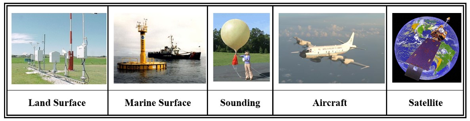
Figure . Weather Observation Sources
Analysis
Analysis is the drawing and interpretation of the patterns of various elements on a weather chart. It is an essential part of the forecast process. If meteorologists do not know what is currently occurring, it is nearly impossible to predict what will happen in the future. Computers have been able to analyze weather charts for many years and are commonly used in the process. However, computers cannot interpret what they analyze. Thus, many meteorologists still perform a subjective analysis of weather charts when needed.
Analysis Procedure
The analysis procedure is similar to drawing in a dot-to-dot coloring book. Just as one would draw a line from one dot to the next, analyzing weather charts is similar in that lines of equal values, or isopleths, are drawn between dots representing various elements of the atmosphere. An isopleth is a broad term for any line on a weather map connecting points with equal values of a particular atmospheric variable. See Table 25-1 for common isopleths.
Table Common Isopleths
| Isopleth | Variable | Definition |
| Isobar | Pressure | A line connecting points of equal or constant pressure. |
| Contour Line (also called Isoheight) | Height | A line of constant elevation above MSL of a defined surface, typically a constant-pressure surface. |
| Isotherm | Temperature | A line connecting points of equal or constant temperature. |
| Isotach | Wind Speed | A line connecting points of equal wind speed. |
| Isohume | Humidity | A line drawn through points of equal humidity. |
| Isodrosotherm | Dewpoint | A line connecting points of equal dewpoint. |
The weather chart analysis procedure begins with a map of the plotted data, which is to be analyzed (see Figure 25-2). It is assumed that bad or obviously incorrect data has been removed before beginning the analysis process. At first, the chart will appear to be a big jumble of numbers. However, when the analysis procedure is complete, patterns will appear, and significant weather features will be revealed.
Step 1: Determine the Optimal Contour Interval and Values to be Analyzed
The first step in the weather chart analysis procedure is to identify the maxima and minima data values and their ranges to determine the optimal contour interval and values to be analyzed. The best contour interval will contain enough contours to identify significant weather features, but not so many that the chart becomes cluttered. Each weather element has a standard contour interval on NWS weather charts, but these values can be adjusted in other analyses as necessary.
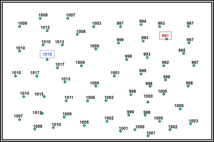
Figure . Analysis Procedure Step 1: Determine the Optimal Contour Interval and Values to be Analyzed
Every contour value must be evenly divisible by the contour interval. So, for example, if the contour interval is every 4 units, a 40-unit contour is all right, but a 41-unit contour is not. In the surface pressure analysis example shown in Figure 25-2, an isobar analysis will be performed beginning at a value of 992 mb and using a contour interval of 4 mb, which is standard on the NWS Surface Analysis Chart.
Step 2: Draw the Isopleths and Extrema
The second step is to draw the isopleths and extrema (maxima and minima) using the beginning contour value and contour interval chosen in the first step (see Figure 25-3). It is usually easiest to begin drawing an isopleth either at the edge of the data domain (edge of the chart) or at a data point that matches the isopleth value being drawn. Interpolation must often be used to draw isopleths between data points and determine the extrema. “Interpolate” means to estimate a value within an interval between known values.
When drawing isopleths and extrema on a weather chart, certain rules must be followed:
- The analysis must remain within the data domain. Analysis must never be drawn beyond the edge of the chart where there are no data points. That would be guessing.
- Isopleths must not contain waves and kinks between two data points. This would indicate a feature too small to be supported by the data. Isopleths should be smooth and drawn generally parallel to each other.
- When an isopleth is complete, all data values must be higher than the isopleth’s value on one side of the line and lower on the other.
- A closed-loop isopleth must contain an embedded extremum (maximum or minimum).
- When a maximum (minimum) is identified, data values must decrease (increase) in all directions away from it.
- Isopleths can never overlap, intersect, or cross over extrema. It is impossible for one location to have more than one data value simultaneously.
- Each isopleth must be labeled. A label must be drawn wherever an isopleth exits the data domain. For closed-loop isopleths, a break in the loop must be created where a label can be drawn. For very long and/or complex isopleths, breaks should be created where additional labels can be drawn, as necessary.
- Extrema must be labeled. Extrema are often denoted by an “x” embedded within a circle. Beneath the label, the analyzed value of the field must be written and underlined.
- Isopleths and labels should not be drawn over the data point values. If necessary, breaks in the isopleths should be created so that the data point values can still be read.
Figure . Analysis Procedure Step 2: Draw the Isopleths and Extrema
Step 3: Identify Significant Weather Features
The third (and final) step is to interpret significant weather features. The conventional labels for extrema are H (high) and L (low) for pressure and height, W (warm) and K (cold) for temperature (they stand for the German words for warm and cold), and X (maxima) and N (minima) for all other elements. Tropical storms, hurricanes, and typhoons are low-pressure systems with their names and central pressures denoted. Troughs, ridges, and other significant features are often identified as well.
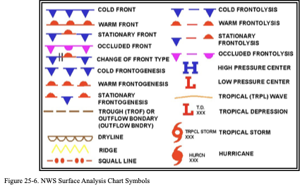
For surface analysis charts, positions and types of fronts are shown by symbols in Figure 25-4. The symbols on the front indicate the type of front and point in the direction toward which the front is moving. Two short lines across a front indicate a change in front type.
Table 25-2 provides the most common weather chart symbols.
In the surface pressure analysis in Figure 25-4, a high, low, trough, and ridge have been identified. Table 25-2. Common Weather Chart Symbols

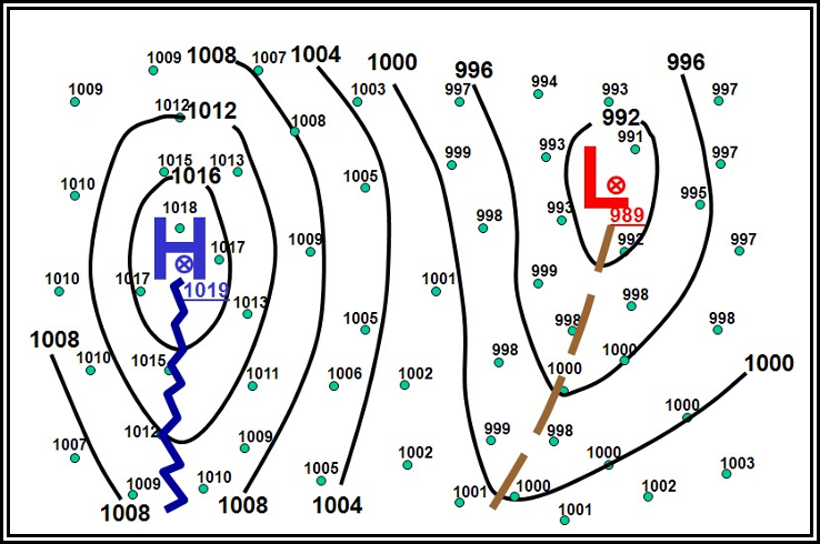
Figure . Analysis Procedure Step 3: Interpret Significant Weather Features
Surface Analysis Chart
The WPC in College Park, MD, produces a variety of surface analysis charts for North America that are available on their website. The WPC’s surface analysis is also available on the AWC’s and other providers’ websites.
A surface chart (also called surface map or sea level pressure chart) is an analyzed chart of surface weather observations. Essentially, a surface chart shows the distribution of sea level pressure (lines of equal pressure are isobars). Hence, the surface chart is an isobaric analysis showing identifiable, organized pressure patterns. The chart also includes the positions of highs, lows, ridges, and troughs, and the location and character of fronts and various boundaries, such as drylines, outflow boundaries, and sea breeze fronts. Although the pressure is referred to as MSL, all other elements on this chart are presented as they occur at the surface point of observation. A chart in this general form is the one commonly referred to as the weather map. See Figure 25-5 for a schematic example of a surface chart.
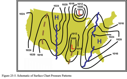
It is one example of several surface analysis products available on the WPC’s website.
Some of the WPC’s surface analysis charts are combined with radar or satellite imagery (see Figure 25-8 and Figure 25-9) as well as having different background features (e.g., terrain).
Issuance
The WPC issues surface analysis charts for North America eight times daily, valid at 00, 03, 06, 09, 12, 15, 18, and 21 UTC.
Analysis Symbols
Figure 25-6 shows analysis symbols used on NWS surface analysis charts.
Examples
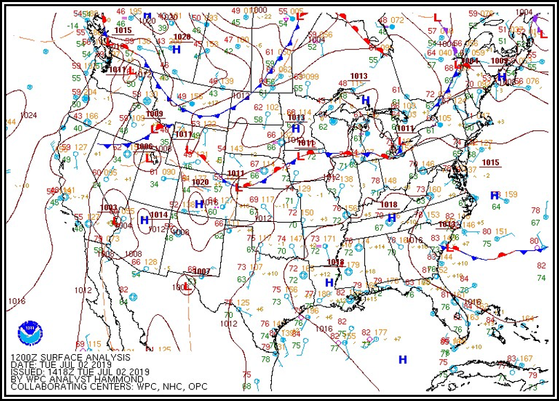
Figure . Example of a Surface Chart with Surface Observations
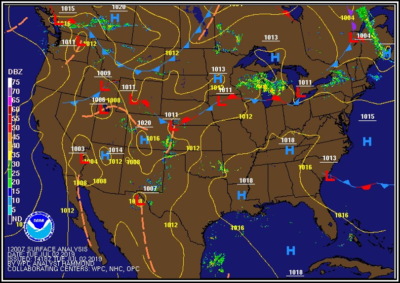
Figure . Surface Analysis with Radar Composite Example
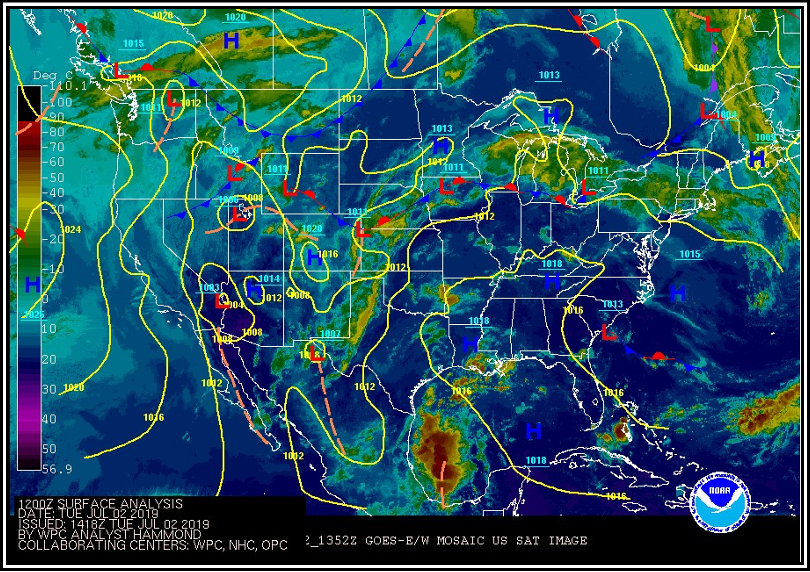
Figure . Surface Analysis with Satellite Composite Example
Station Plot Models
Land, ship, buoy, and C-MAN stations are plotted on the chart to aid in analyzing and interpreting the surface weather features. These plotted observations are referred to as station models. Some stations may not be plotted due to space limitations. However, all reporting stations are used in the analysis.
Figure 25-10 and Figure 25-11 contain the most commonly used station plot models used in surface analysis charts.
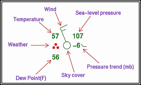
Figure . NWS Surface Analysis Chart Station Plot Model
Figure . NWS Surface Analysis Chart Ship/Buoy Plot Model
The WPC also produces surface analysis charts specifically for the aviation community. Figure 25-12 contains the station plot model for these charts.
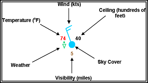
Figure . NWS Surface Analysis Chart for Aviation Interests Station Plot Model
Station Identifier
The format of the station identifier depends on the observing platform:
- Ship: Typically four or five characters. If five characters, then the fifth will usually be a digit.
- Buoy: Whether drifting or stationary, a buoy will have a five-digit identifier. The first digit will always be a 4.
- C-MAN: Usually located close to coastal areas. Their identifier will appear like a five-character ship identifier; however, the fourth character will identify off which state the platform is located.
- Land: Land stations will always be three characters, making them easily distinguishable from ship, buoy, and C-MAN observations.
Temperature
The air temperature is plotted in whole degrees Fahrenheit.
Dewpoint
The dewpoint temperature is plotted in whole degrees Fahrenheit.
Weather
A weather symbol is plotted if, at the time of observation, precipitation is either occurring or a condition exists causing reduced visibility.
Figure contains a list of the most common weather symbols.
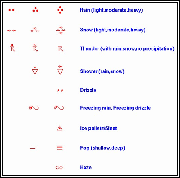
Figure NWS Surface Analysis Chart Common Weather Symbols
Wind
Wind is plotted in increments of 5 kt. The wind direction is referenced to true north and is depicted by a stem (line) pointed in the direction from which the wind is blowing. Wind speed is determined by adding the values of the flags (50 kt), barbs (10 kt), and half-barbs (5 kt) found on the stem.
If the wind is calm at the time of observation, only a single circle over the station is depicted. Figure 25-14 includes some sample wind symbols.
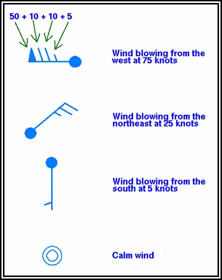
Figure . NWS Surface Analysis Chart Sample Wind Symbols
Ceiling
Ceiling is plotted in hundreds of feet AGL.
Visibility
Surface visibility is plotted in whole statute miles.
Pressure
Sea level pressure is plotted in tenths of millibars, with the first two digits (generally 10 or 9) omitted. For reference, 1013 mb is equivalent to 29.92 inHg. Below are some sample conversions between plotted and complete sea level pressure values.
| 410 | 1041.0 mb |
| 103 | 1010.3 mb |
| 987 | 998.7 mb |
| 872 | 987.2 mb |
Pressure Trend
The pressure trend has two components, a number and a symbol, to indicate how the sea level pressure has changed during the past 3 hours. The number provides the 3-hour change in tenths of millibars, while the symbol provides a graphic illustration of how this change occurred.
Figure contains the meanings of the pressure trend symbols.
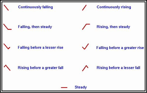
Figure . NWS Surface Analysis Chart Pressure Trends
Sky Cover
The approximate amount of sky cover can be determined by the circle at the center of the station plot. The amount that the circle is filled reflects the amount of sky covered by clouds. Figure 25-16 contains the common cloud cover depictions.
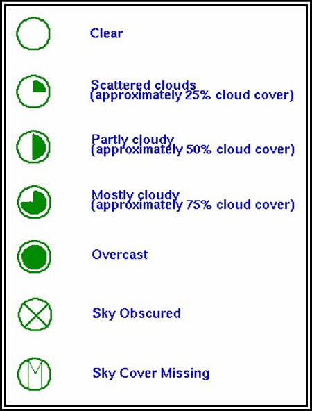
Figure NWS Surface Analysis Chart Sky Cover Symbols
Water Temperature
Water temperature is plotted in whole degrees Fahrenheit.
Swell Information
Swell direction, period, and height are represented in the surface observations by a six-digit code. The first two digits represent the swell direction, the middle digits describe the swell period (in seconds), and the last two digits are the swell’s height (in half meters).
090703:
- 09: The swell direction is from 90° (i.e., it is coming from due east).
- 07: The period of the swell is 7 seconds.
- 03: The height of the swell is 3 half m.
271006:
- 27: The swell direction is from 270° (due west).
- 10: The period is 10 seconds.
- 06: The height of the swell is 6 half m.
Wave Information
Period and height of waves are represented by a five-digit code. The first digit is always 1. The second and third digits describe the wave period (in seconds), and the final two digits give the wave height (in half meters).
10603:
- 1: A group identifier. The first digit will always be 1.
- 06: The wave period is 6 seconds.
- 03: The wave height is 3 half m.
10515:
- 1: A group identifier.
- 05: The wave period is 5 seconds.
- 15: The wave height is 15 half m.
In some charts by the OPC, only the wave height (in feet) is plotted.
Unified Surface Analysis Chart
The NWS Unified Surface Analysis Chart is a surface analysis product produced collectively and collaboratively by the NWS WPC, the OPC, the NHC, and WFO Honolulu. The chart contains an analysis of isobars, pressure systems, and fronts.
This chart is available on the OPC’s website as well as the AWC’s website. Users can zoom in by clicking an area on the map to enlarge (see Figure 25-17 and Figure 25-18) and show station plot models.
Issuance
The Unified Surface Analysis Chart is issued four times daily for valid times 00, 06, 12, and 18 UTC.
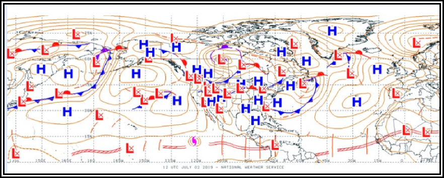

Figure .Unified Surface Analysis Chart Example (Enlarged Area)
Analysis Symbols
Unified Surface Analysis Charts use the symbols shown in Figure 25-6.
AAWU Surface Chart
The NWS Unified Surface Analysis Chart covers the Alaska area. The AAWU also provides a fixed area image of the Unified Surface Analysis Chart centered over Alaska (see Figure 25-19). This chart is available from the AAWU’s website.
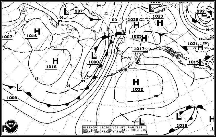
Figure . Unified Surface Analysis Chart Example with Fixed Area Coverage over Alaska
Upper-Air Analysis
An upper air chart (also known as a constant-pressure chart or an isobaric chart) is a weather map representing conditions on a surface of equal atmospheric pressure. A constant-pressure surface is a surface along which the atmospheric pressure is everywhere equal at a given instant. For instance, the 500 mb constant-pressure surface has a pressure of 500 mb everywhere on it. For example, a 500 mb chart will display conditions at the level of the atmosphere at which the atmospheric pressure is 500 mb.
Constant-pressure charts usually contain plotted data and analyses of the distribution of height of the surface (contours), wind (isotachs), temperature (isotherms), and sometimes humidity (isohumes). The height above sea level at which the pressure is that particular value may vary from one location to another at any given time, and also varies with time at any one location, so it does not represent a surface of constant altitude/height (i.e., the 500 mb level may be at a different height above sea level over Dallas than over New York at a given time, and may also be at a different height over Dallas from one day to the next). The height (altitude) of a constant-pressure surface varies primarily due to temperature; these heights can be measured by a rawinsonde.
Constant-pressure charts are most commonly known by their pressure value (see Table 25-3 for common constant pressure levels). For example, the 1,000 mb chart (which closely corresponds to the surface chart), the 850 mb chart, 700 mb chart, 500 mb chart, etc.
A contour analysis (see Figure 25-20 and Figure 25-21) can reveal highs, ridges, lows, and troughs aloft just as the surface chart shows such systems at the surface. These systems of highs/ridges and lows/troughs are called pressure waves. These pressure waves are similar to waves seen on bodies of water. They have crests (ridges) and valleys (troughs) and are in constant movement.
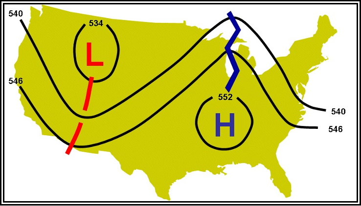
Figure .Schematic of 500 mb Constant-Pressure Chart
Table .Common Constant-Pressure Charts
| Chart | Pressure Altitude (approximate) | |
| Feet (ft) | Meters (m) | |
| 100 mb | 53,000 ft | 16,000 m |
| 150 mb | 45,000 ft | 13,500 m |
| 200 mb | 39,000 ft | 12,000 m |
| 250 mb | 34,000 ft | 10,500 m |
| 300 mb | 30,000 ft | 9,000 m |
| 500 mb | 18,000 ft | 5,500 m |
| 700 mb | 10,000 ft | 3,000 m |
| 850 mb | 5,000 ft | 1,500 m |
| 925 mb | 2,500 ft | 750 m |
Issuance
The NWS provides data to produce upper-air analysis charts. Examples
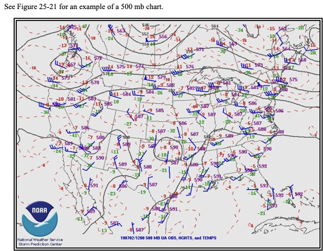
Figure 25-21. Example of a 500 mb Constant-Pressure Chart
Constant pressure level forecasts are used to provide an overview of weather patterns at specified times and pressure altitudes and are the source for wind and temperature aloft forecasts.
Pressure patterns cause and characterize much of the weather. Typically, lows and troughs are associated with clouds and precipitation, while highs and ridges are associated with fair weather, except in winter when valley fog may occur. The location and strength of the jet stream can be viewed at 300 mb, 250 mb, and 200 mb levels.
Radiosonde Observation (Weather Balloon) Analysis
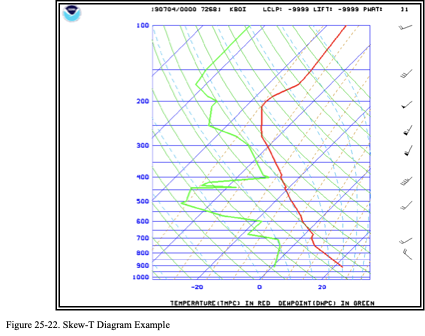
A common means of analyzing radiosonde observations is the skew-T diagram (see Figure 25-22). Skew-T diagrams are primarily intended for, and used by, meteorologists as part of their analyses of the atmosphere. For example, the skew-T diagram can be used to:
- Determine the freezing level (or levels);
- Determine the stability of the atmosphere;
- Determine the potential for severe weather;
- Determine the height and depth of inversions; • Infer cloud bases, tops, and layers; and
- Determine soaring conditions.
Issuance
Skew-T diagrams are primarily intended for, and used by, meteorologists as part of their analyses of the atmosphere and formulation of various forecasts.
Skew-T diagrams are available from the NWS NCO. Their “Model Analyses and Guidance” website contains a user’s guide that provides descriptions, details, and examples of the various products, including the skew-T.
Format
The skew-T diagram provided on the NWS NCO “Model Analyses and Guidance” website uses the following format (other weather providers and websites may have different formats, especially colors):
- Horizontal axis is temperature in degrees Celsius, skewed to the right, labeled -20, 0, and 20 (Celsius).
- Vertical axis is pressure levels in millibars, labeled 1,000 (near sea level) to 100 (approximately 53,000 ft MSL).
- Bold, solid red line represents the temperature profile over the station taken from the radiosonde observation (weather balloon).
- Bold, solid green line represents the dewpoint profile.
- Wind aloft is shown on the far right side.
Examples
Two examples are provided below: a multiple freezing level example (see Figure 25-23) and a cloud top example (see Figure 25-24).
Multiple Freezing Level Example
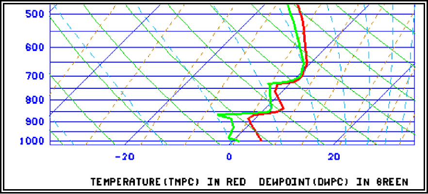
Note how the temperature profile (bold red line) crosses the 0 degree temperature line (also known as an isotherm) 5 times (near 900 mb, 860 mb, 775 mb, 725 mb, and 675 mb).
Figure . Skew-T Diagram—Multiple Freezing Level Example
Cloud Top Example
Figure is the radiosonde observation from Vandenberg Air Force Base (VAFB), California, for 1200 UTC for a typical coastal stratus cloud.
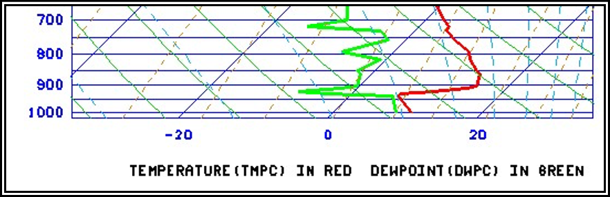
At about 950 mb, the temperature profile (bold red line) and dewpoint profile (bold green line) almost touch each other. This is the profile of a cloud top. The temperature and dewpoint quickly diverge, representing a change from the cool, moist air (and associated stratus cloud) to the dry and warmer air (cloud free) above.
Figure . Skew-T Diagram—Cloud Top Example
Freezing Level Analysis
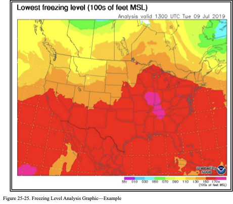
The freezing level is the lowest altitude in the atmosphere over a given location at which the air temperature reaches 0 °C. This altitude is also known as the height of the 0 °C constant-temperature surface. A freezing level analysis graphic (see Figure 25-25) shows the height of the 0 °C constant-temperature surface.
The initial analysis is updated hourly. The colors represent the height in hundreds of feet above MSL of the lowest freezing level. Regions with white indicate the surface and the entire depth of the atmosphere are below freezing. Hatched or spotted regions (if present) represent areas where the surface temperature is below freezing with multiple freezing levels aloft.
More information on the freezing level forecast graphics is available on the AWC’s website.
Icing Analysis (Current Icing Product (CIP))
The NWS produces icing products that are derived from NWS computer model data with no forecaster modifications. One of these products is the CIP.
The CIP combines sensor and NWS model data to provide an hourly 3D diagnosis of the icing environment. This information is displayed on a suite of graphics available for the CONUS, much of Canada and Mexico, and their respective coastal waters. See Figure 25-26 for an example CIP Analysis.
The CIP (and its forecast counterpart Forecast Icing Product (FIP) (see Section 27.12)) provide a broad-brush approach to describing icing intensity using estimated liquid water content, drop size, and temperature to depict ice accumulation rate. The intensity of ice accumulation rate varies by aircraft wing shape. Hence, the icing intensity categories depicted in CIPs and FIPs (e.g., none, light, moderate, heavy) is only a broad-brushed indication of ice accumulation rate, and not necessarily of aircraft performance. The icing terms used in SIGMETs and AIRMETs do refer to icing impact on aircraft.
CIPs will continue to evolve over the coming years with increased model resolutions, additional horizontal layers, and improvements to the algorithms and/or data sets used to produce the products. Along with these improvements may come a change in references to the product update version. Users can find additional information on these products and any changes on the AWC’s icing website.
The CIP suite as it appears on the AWC’s website consists of five graphics, including:
- Icing Probability
- Icing Severity
- Icing Severity—Probability > 25 percent
- Icing Severity—Probability > 50 percent
- Icing Severity plus .
The CIPs are generated for select altitudes from 1,000 ft MSL to FL300.
The CIPs can be viewed at single altitudes and FLs or as a composite of all altitudes from 1,000 ft MSL to FL300, which is referred to as the “maximum” or “max.”
The CIP can be used to identify the latest and forecast 3D probability and intensity of ice accumulation rate. The CIP should be used in conjunction with the report and forecast information contained in an AIRMET and SIGMET.
The Icing Severity plus SLD product can help in determining the threat of SLD, which is particularly hazardous to some aircraft.
Icing PIREPs are plotted on a single-altitude CIP graphic if the PIREP is within 1,000 ft of the selected altitude and has been observed within 75 minutes of the chart’s valid time. Icing PIREPs for all altitudes (i.e., 1,000 ft MSL to FL300) are displayed, except negative reports are omitted to reduce clutter. The PIREP legend is located on the bottom of each graphic.
Finally, while the “C” in CIP stands for “current,” the product does not show the current conditions, rather it depicts the computer’s expected conditions at the valid time shown on the product. This valid time can be an hour old or more depending on when it is received by the user.
See Section for additional information on the FIP.
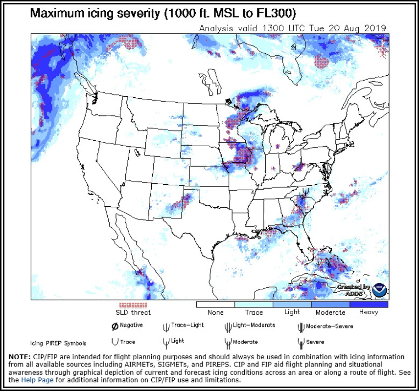
Figure . CIP Maximum Icing Severity Plus SLD—Max Example
Turbulence (Graphical Turbulence Guidance (GTG)) Analysis
The NWS produces a turbulence product that is derived from NWS model data with no forecaster modifications. This product is the GTG.
The GTG computes the results from more than 10 turbulence algorithms, then compares the results of each algorithm with turbulence observations from both PIREPs and AMDAR data to determine how well each algorithm matches reported turbulence conditions from these sources. See Figure 25-27 for an example of the GTG Analysis.
The GTG Analysis is essentially a 0-hour GTG forecast and is labeled accordingly. This product overlays turbulence PIREPs that correspond to the valid time of the product.
This turbulence product will continue to evolve over the coming years with increased model resolutions, additional horizontal layers, and improvements to the algorithms and/or data sets used to produce the product. Users can find additional information on these products and any changes on the AWC’s turbulence web page. See Section 27.13 for additional information on the GTG forecast
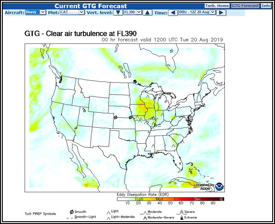
Figure . GTG Analysis—FL390 Example (Clear Air Turbulence)
Real-Time Mesoscale Analysis (RTMA)
RTMA is an hourly analysis system by the NWS’s Environmental Modeling Center that produces analyses of surface weather elements. The FAA has determined that RTMA temperature information is a suitable replacement for missing temperature observations for a subset of airports. RTMA temperature is intended for use by operators, pilots, and aircraft dispatchers when an airport lacks a surface temperature report from an automated weather system (e.g., ASOS or AWOS sensor) or human observer. Airports with RTMA data available are located in Alaska, Guam, Hawaii, Puerto Rico, and the CONUS.
RTMA is issued by the NWS every hour, 24 hours a day. Temperatures are reported for an airport station including the latitude and the longitude. Temperatures are reported in degrees Celsius. See Figure 25-28 for an example RTMA temperature report.
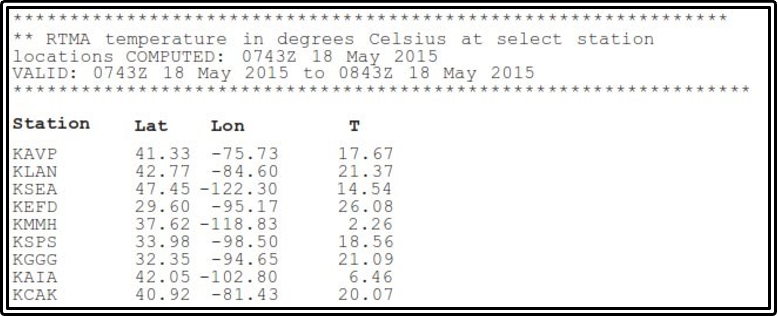
Figure . RTMA Surface Temperature Example


